How to Design a Button Using Css
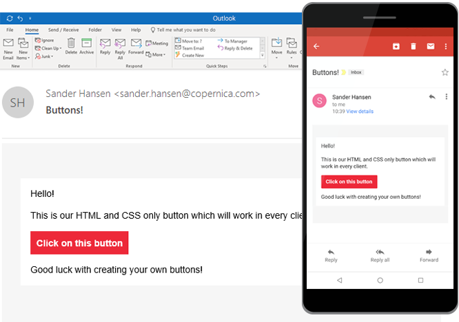
A call to action button is an important element of an effective email. But how can we make sure everyone receives the button the way you want?
People tend to use images, a rookie mistake because people can turn their images off. Therefore we will create a responsive email button with only HTML and CSS.

Problems when creating an email button
Each client processes the HTML and CSS differently but we still want it to do the same thing in each client. There are two major problems when creating a HTML button for email.
- The flexibility
- The clickability
Most of the time when people create a button they will either use a border or a padding. While a button created with a border is very flexible (no dimensions need to be specified) and the entire button is clickable, it fails to work in Outlook. A button created with padding works in Outlook, but only the text is clickable.
We can however combine both the padding and the border to create a button which will never fail to work.
HTML
First we will create a wrapper table with the actual button table inside it. The wrapper is created to make sure the button stays in place. In the button table we create a cell which we have to give a background color.
<table width="100%" cellspacing="0" cellpadding="0"> <tr> <td> <table cellspacing="0" cellpadding="0"> <tr> <td class="button" bgcolor="#ED2939"> <a class="link" href="https://www.copernica.com" target="_blank"> Click </a> </td> </tr> </table> </td> </tr> </table> CSS
Now we can apply the padding and the border to the link itself to make sure the whole button is clickable. The display style has to be inline-block to let the horizontal padding work.
.button { border-radius: 2px; } .button a { padding: 8px 12px; border: 1px solid #ED2939; border-radius: 2px; font-family: Helvetica, Arial, sans-serif; font-size: 14px; color: #ffffff; text-decoration: none; font-weight: bold; display: inline-block; } Inline
If you don't want to work with classes in your emails you can of course use inline styling.
<table width="100%" cellspacing="0" cellpadding="0"> <tr> <td> <table cellspacing="0" cellpadding="0"> <tr> <td style="border-radius: 2px;" bgcolor="#ED2939"> <a href="https://www.copernica.com" target="_blank" style="padding: 8px 12px; border: 1px solid #ED2939;border-radius: 2px;font-family: Helvetica, Arial, sans-serif;font-size: 14px; color: #ffffff;text-decoration: none;font-weight:bold;display: inline-block;"> Click </a> </td> </tr> </table> </td> </tr> </table> Related articles
html imageless buttons html email friendly buttons
Free responsive HTML email templates
If you are looking for some email design inspiration for your next campaign. Have a look at the HTML email templates created by the team at Copernica Marketing Software. These guys know quite a lot about the ins and outs of HTML for email design. So rest assured that these emails work in popular email clients such as Apple Mail, Gmail, Thunderbird and Outlook. Oh and did I mention that they are optimized for mobile phones too?
HTML email guidelines revisited
Some people say HTML email design is hard. I don't think it is. Sure, the latest HTML/CSS techniques are not supported sometimes. But that's okay. It means you have to worry less about the bells and the whistles and more about the content you want to share with others.
Over the past 6 years I've learned a few things about coding HTML emails and I would like to share this knowledge with you. So if you're just starting out as an HTML email designer, this article is for you. And if you're a seasoned HTML email designer, who knows you might learn a thing a two (or you can add more tips in the comment section below).
Remove unwanted gaps in Microsoft Outlook
In some cases, Outlook 2007 and 2010 magically render unwanted gaps in your HTML email. Especially when you're using two columns and your email is supposed to be responsive. Are you running into this little problem? Hopefully this article will help you fix it once and for all.
How to Design a Button Using Css
Source: https://www.copernica.com/en/blog/post/how-to-create-email-buttons-with-just-html-and-css
0 Response to "How to Design a Button Using Css"
Mag-post ng isang Komento